Logo Designs
Mosaic Church vb
- Round 3 -
Hello again! Below are the variations that we discussed for the logo today.
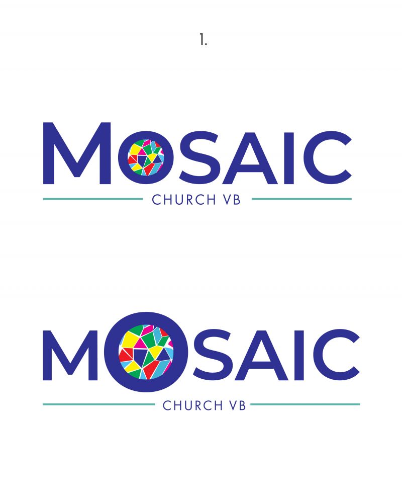
Page #1 has the chosen base logo with the Small Caps look, and also the version with larger "O".
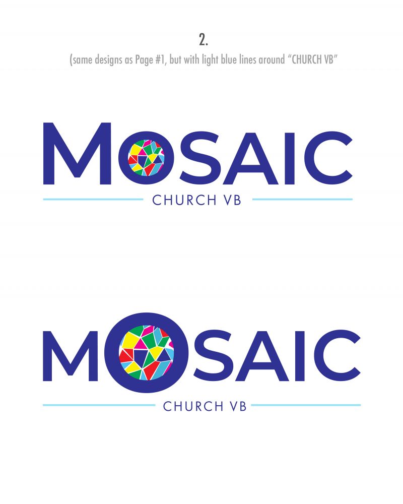
Page #2 is the same designs as Page #1, but with a light blue line option.
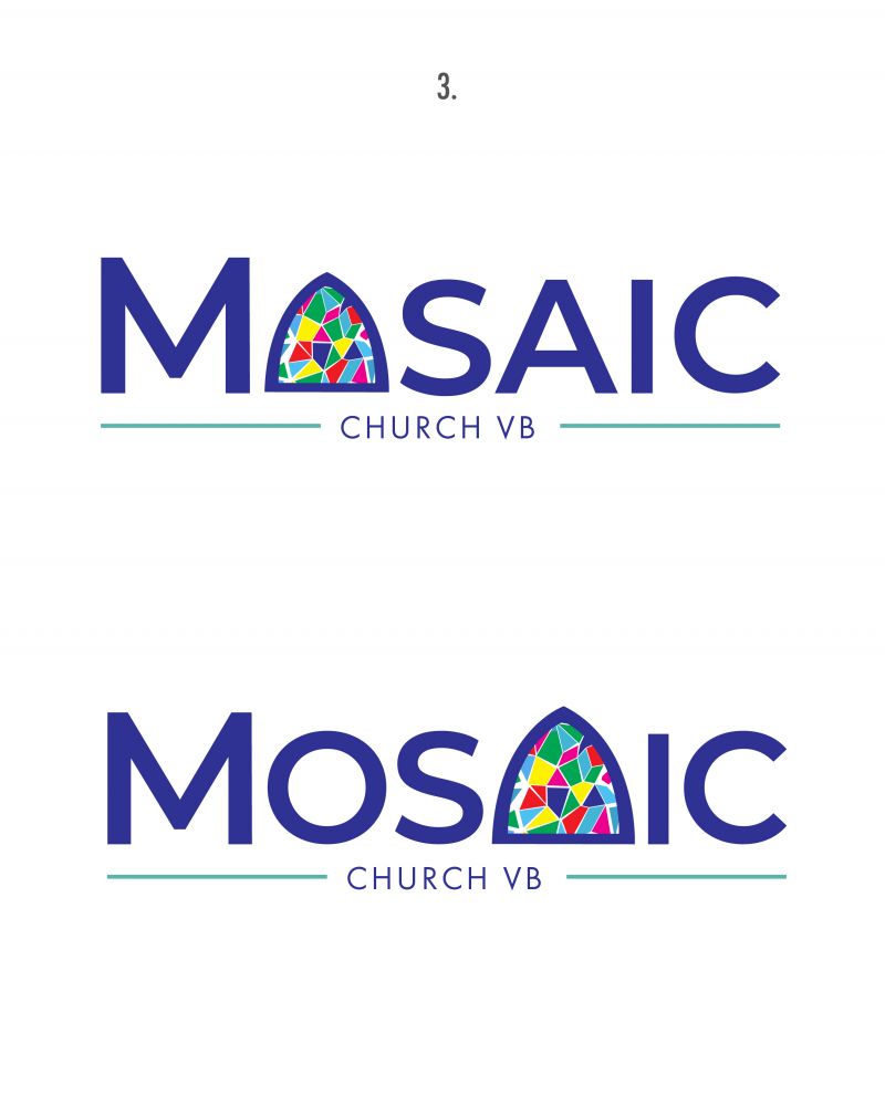
Page #3 uses the curved window as the "O". After looking at it though, I feel the shape of the window more resembles the shape of the "A" in MOSAIC, so I created that option as well for you to see.
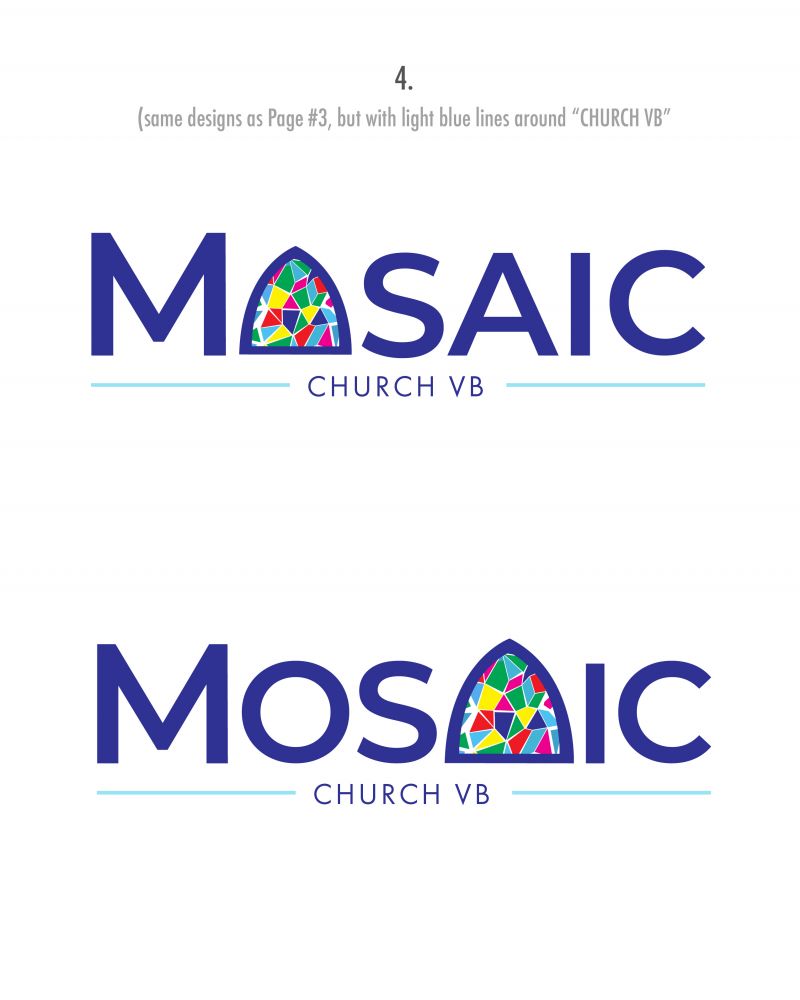
Page #4 then has the same designs as Page #3, but with a light blue line options.
Just let us know your thoughts! Thanks!


